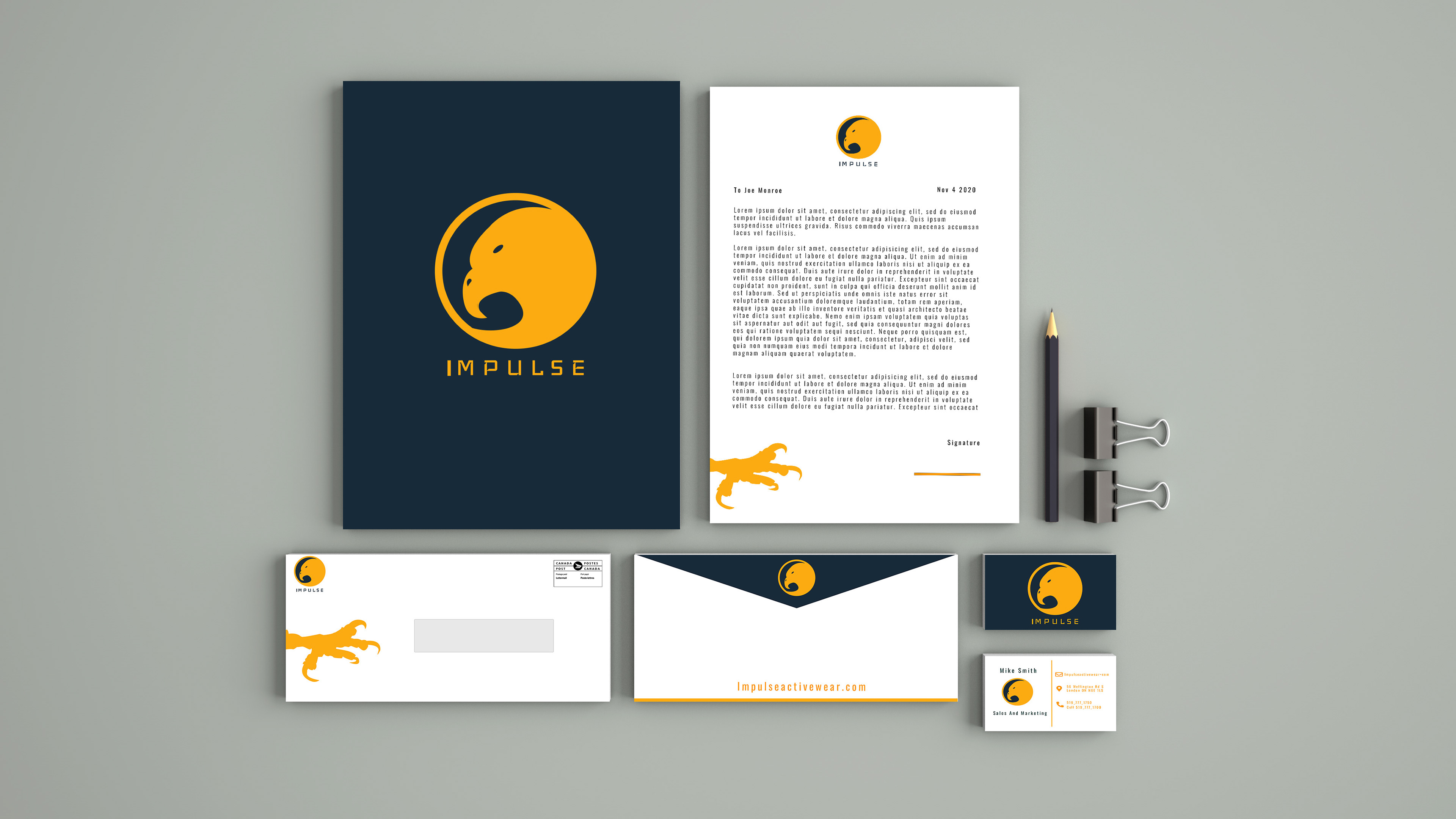
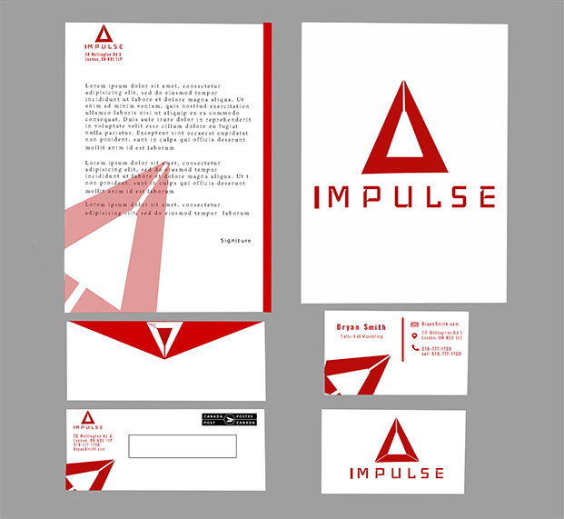
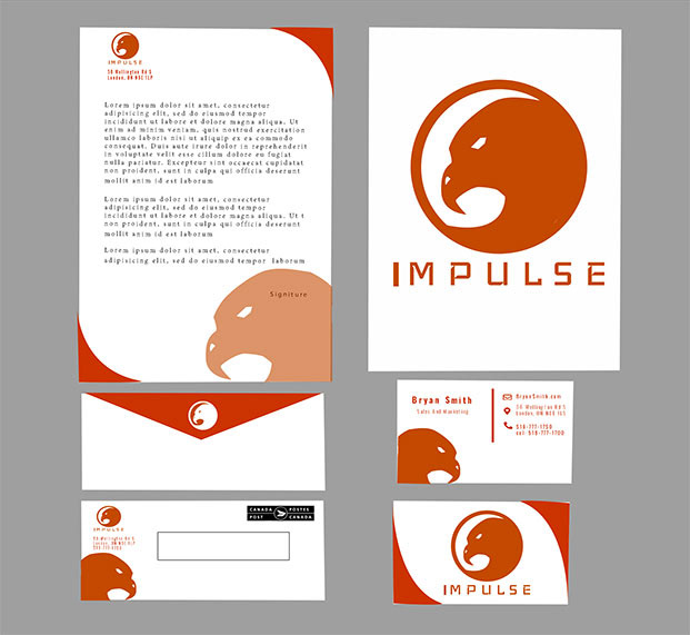
Final Stationary Mockup
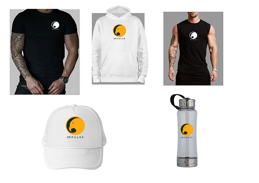
Final Products Mockups
Objective
The objective of the project was to create a corporate stationery package for a company that we created. The company that I created was called Impulse Activewear. They are a new fitness clothing company and they needed their company to be well branded. They wanted a branding that was sharp and distinctive from the other companies similar to theirs. They wanted to have a look that was unique to them as a company allowing for consumers to recognize their brand.
Process
The first challenge for this project was to come up with a brand identity that would suit the company Impulse Activewear and the products they made. I kept the goal that the client wanted a unique brand identity in mind and started to sketch out logo ideas that were versatile. I ended up settling on two ideas, one being an eagle graphic and the other being a triangle graphic. I wanted a special emblem to be associated with the company because it would allow for more branding opportunities. I wanted the company to be recognizable through multiple logo variations and to compete with companies like Under Armour and Nike.
Through the next process steps I played around with looks, layouts and colors for both logo ideas. I knew it was important to see both ideas at their full potential, that way I could make the decision on which was the better choice. I ended up deciding that the bird logo was the stronger choice because it gave the company a strong identity and a bold emblem that could be used for many mediums. The next issue was that the first variation of the logo was too complex, with the bird having too much detail. This problem was solved by stripping away all the details and putting a simple silhouette of a bird inside a circle. This choice led to a stronger design because it allowed the emblem to have limited space and was easier to remember from a consumer standpoint. In the final design just having the Impulse name was more effective because people remember short brand names better, and this would also allow for effective promotion across various mediums.
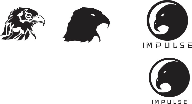
Hawk Logo Rough Ideas
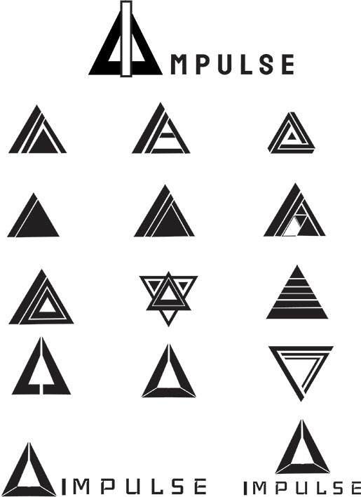
Triangle Logo Rough Ideas
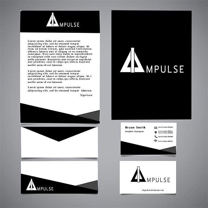
Triangle Stationary Rough
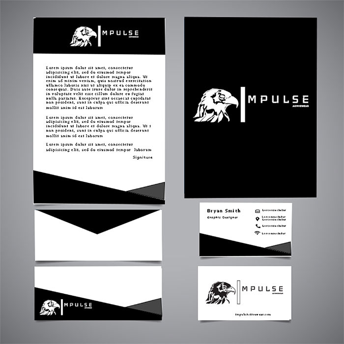
Hawk Stationary Rough
One constant issue that I was having when designing was the color that would represent this company. I knew that color plays an important role when it comes to brand identity so I played around a lot with the logo color variations. I quickly realized that one color was not giving the boldness that the client had wanted. In the final design the color choices worked to give a bold, strong and trustworthy brand. The two colours perfectly contrasted each other both in the look and the philosophy that the company would stand for. The blue shows trust and loyalty to the customer while the yellow represents the bold and fun that should come with fitness.
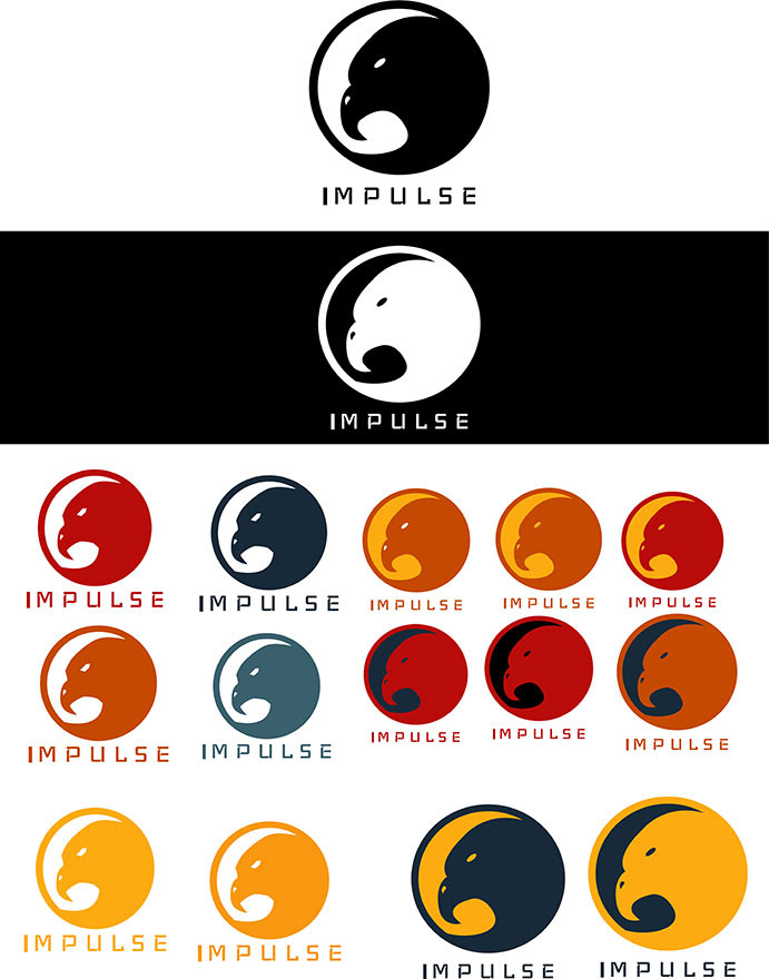
Hawk Colour Schemes
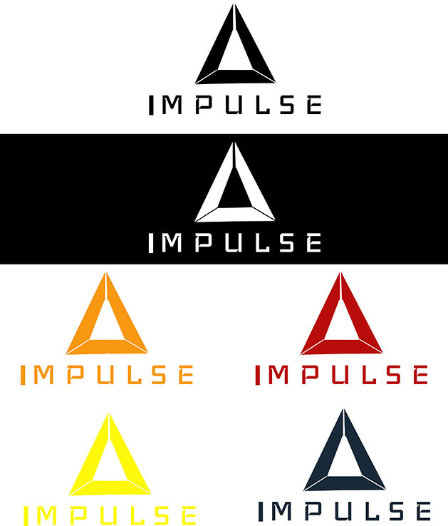
Triangle Colour Schemes
Triangle Stationary Semis
Hawk Stationary Semi
Tools Used
Adobe Illustrator and Adobe Photoshop