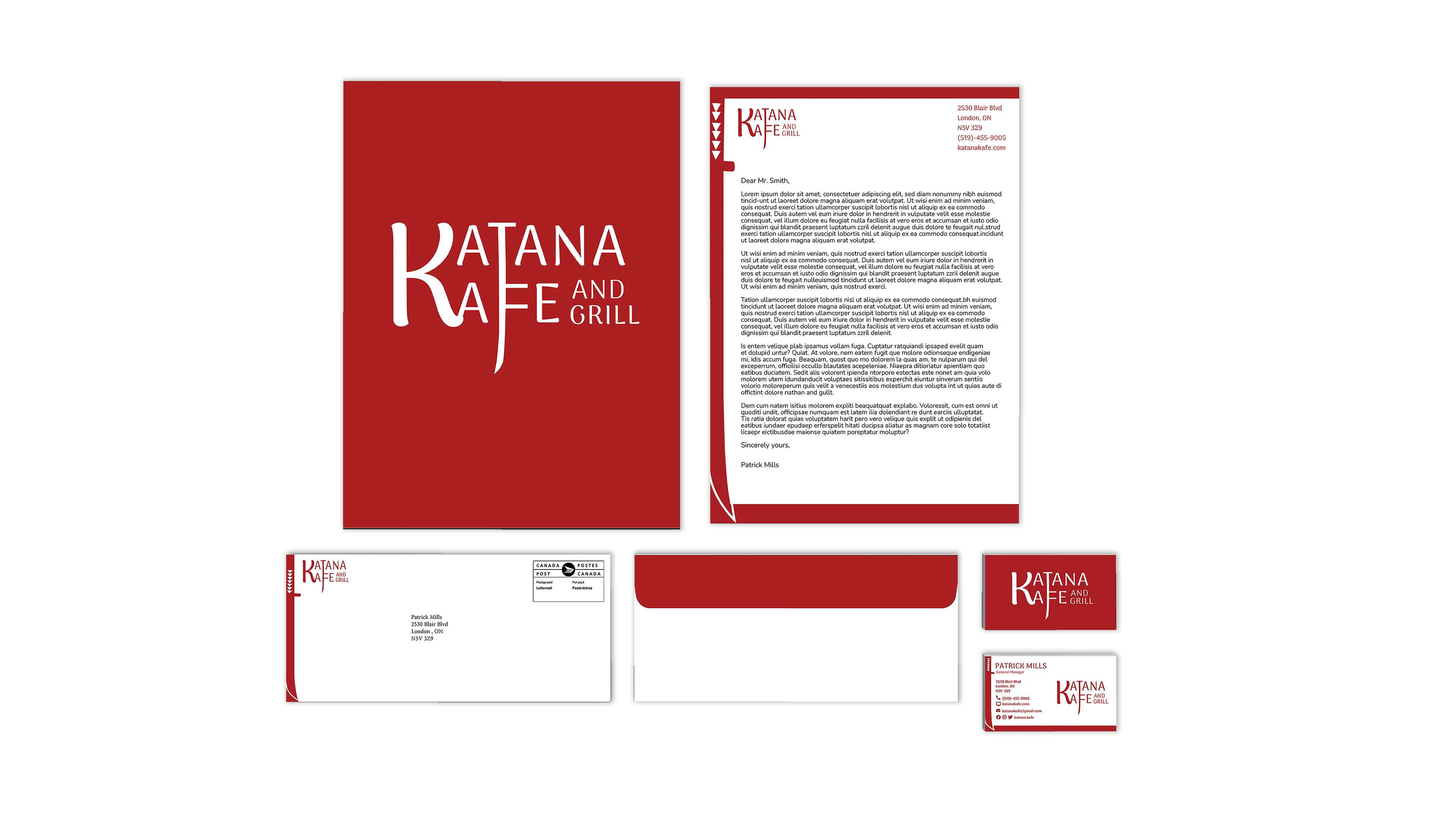
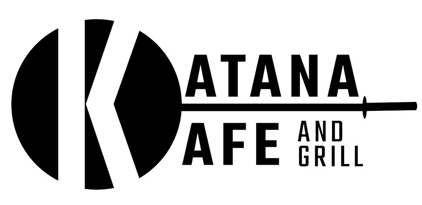
Final Stationary Design
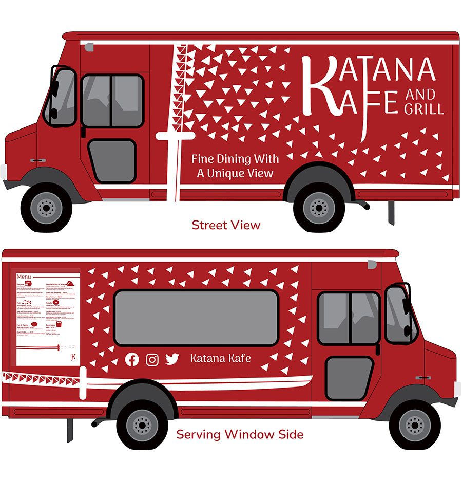
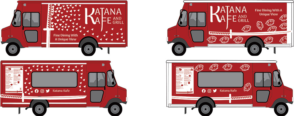
Final Food Truck Design
Objective
The objective of the project was to help a restaurant within London, Ontario rebrand itself to reach more customers. The client for this project was Katana Kafe And Grill and they were struggling to keep customers interested in their restaurant. The client wanted a unique and different brand identity that would draw people’s interest therefore increasing their sales. The second part of the project was the client wanted a food truck for their restaurant. They wanted a unique look that represented their new brand to reach the youth of the community.
Process
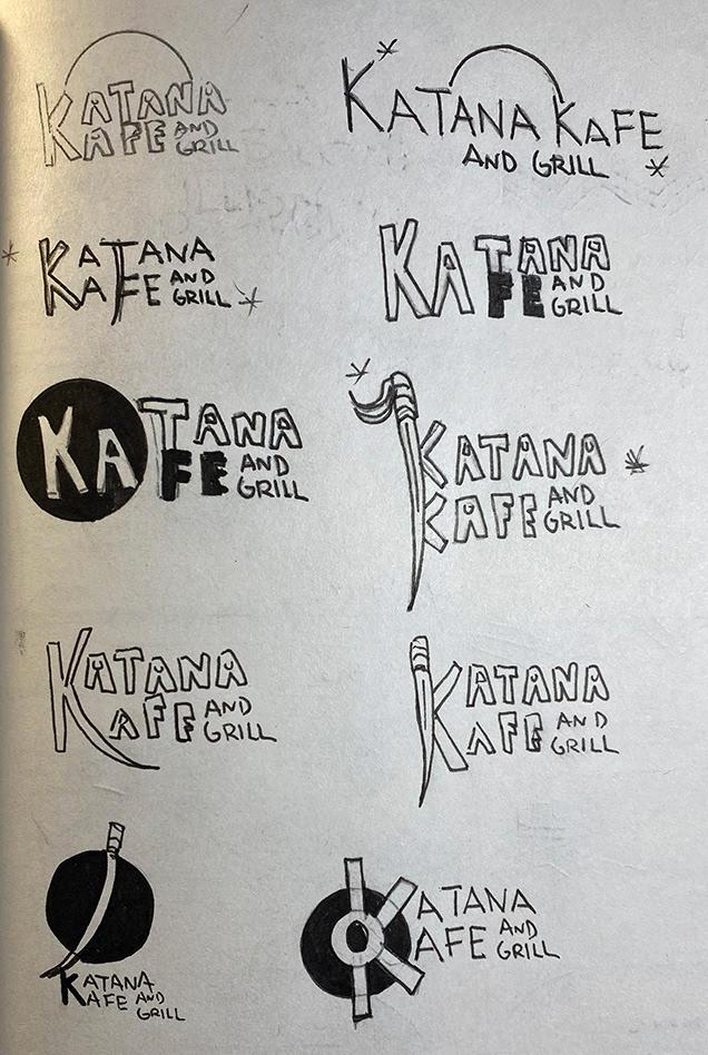
The project started with looking at the current branding and look of the Katana Kafe and Grill restaurant. I had to determine what made their identity and why they were struggling. I realized that the logo would need a complete rework and the color scheme of the brand would need to be changed because it was too corporate. The restaurant name was unique and fun therefore I decided to play around with it when sketching out logo ideas. In the early stages I wanted to utilize the name of the restaurant and what made them unique. The restaurant had a airstrip that people could land and take off at all while eating at the restaurant. I played with this idea in pencil sketches and when I developed three rough concepts. The concept that I ended up choosing to go forward with was the first one because it was simple, strong and played off the name of the restaurant through a simple graphic. I felt that this logo encapsulated who the restaurant was by having a new fun and classy look.
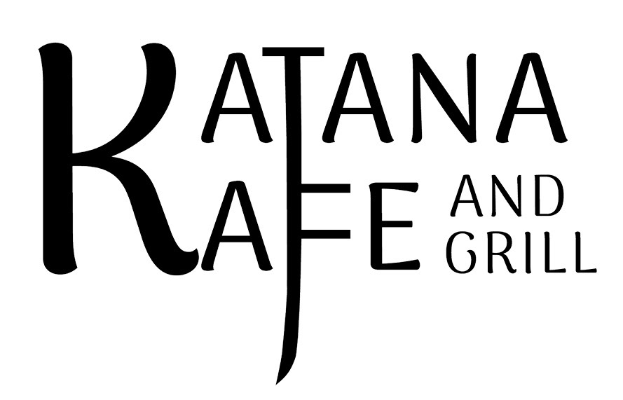
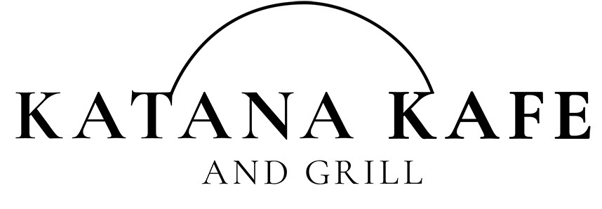
The next challenge was the color scheme that would represent the new look for Katana Kafe and Grill. I experimented with different color combinations but realized that the logo did not feel right when there was more than one colour added. I decided that the logo was stronger being monotone versus having more colors. The final color choice being a darker red hue was powerful because it showed a bold flare to the restaurant’s new identity while remaining a high class restaurant. Overall the new logo helped the restaurant by showing a new bold personality that the restaurant was missing before. A style guide was created to help the restaurant understand the new logo rules.
The other job was to create a food truck and selective menu that the restaurant could use to cater towards the youth of the city. I wanted the food truck to grab people’s attention and entice them to buy the food at the truck. The truck is the new brand red so that the truck stands out from the rest of the competition. The one challenge was deciding what graphics would appear on the truck. I came up with two different concepts for the look of the truck one being wontons and the other being a katana with a fading pattern. The final choice ended up being the second concept with the katana because the graphics helped play off the restaurant name and created a sharp look for the truck.
Food Truck Semi Concepts
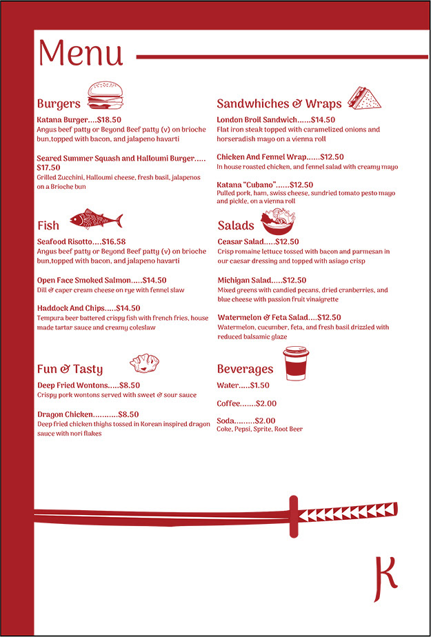
Food Truck Final Menu
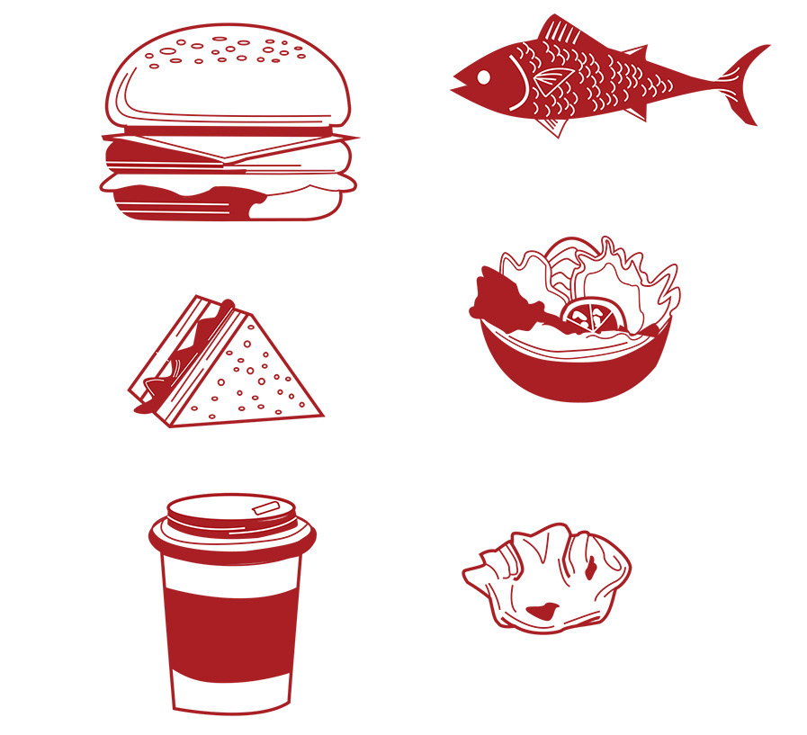
Food Truck Menu Illustrations
Tools Used
Adobe Illustrator, Adobe Photoshop and Adobe Indesign